

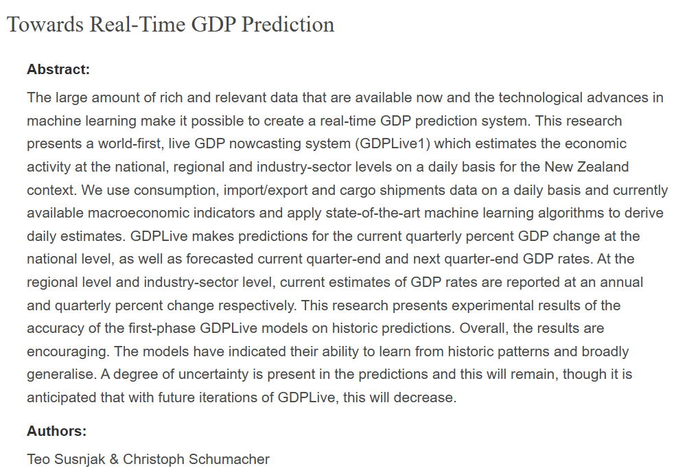
This was the abstract from the authors’ 2018 paper (on the website at the link above) on what they are doing

Click to view
Click to view
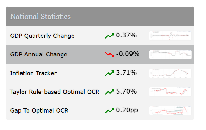
It is great to see people doing this sort of stuff and making the results available routinely and accessibly. It is particularly good to see economics academics in New Zealand doing some policy-relevant New Zealand focused stuff. They publish daily updates of quarterly estimates of several macro variables
Click to view
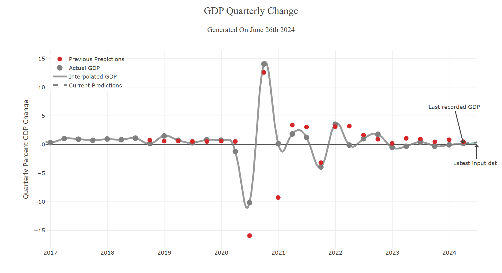
Prebble’s focus was on the quarterly change in (production) GDP numbers. Here is the GDP-Live chart for that variable
Click to view
If you just give it a quick glance it doesn’t look too bad – those “previous predictions” don’t look too consistently different from the grey dots, the latest vintage of SNZ actual data (note that “latest vintage” is not innocuous, since recently published outcomes are often revised for several years as more data come available to SNZ. And while “true” GDP growth is probably what should be being aimed for, it is less use than “first release” GDP data unless users can be confident that GDP-Live is producing really quite reliable estimates of the final number that won’t settle for several years).
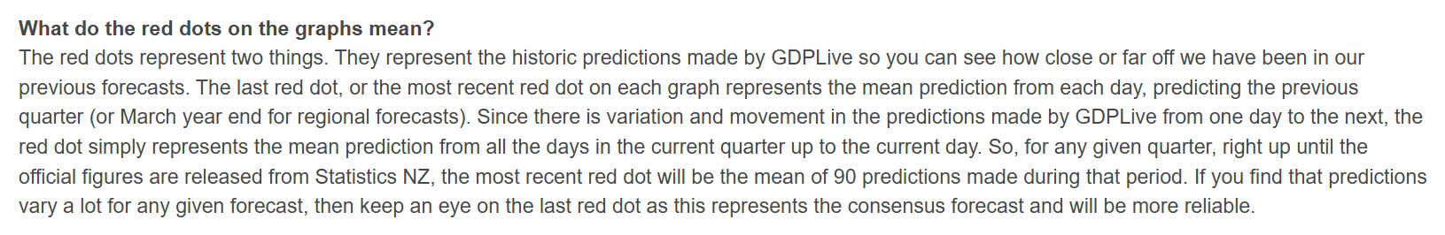
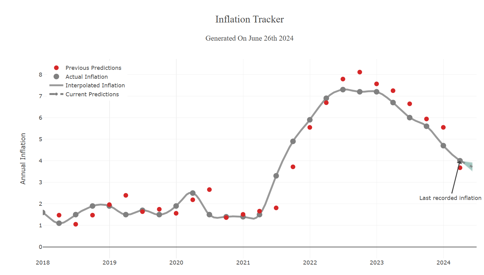
Here is how the “previous predictions” (red dots) are described
Click to view
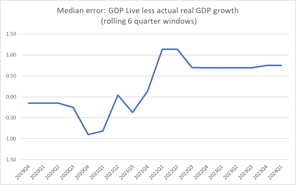
But scale is a bit of a problem in just eyeballing the chart. There were those two very very dramatic quarters around the first Covid lockdown, which push the scale out so far that it is very difficult to meaningfully eyeball any of the other data.
So I laboriously transcribed the red dot numbers into a spreadsheet and compared them against the latest vintage SNZ data. How accurate were the red-dot average predictions?
Well, not very at all (so far). Over the almost six years of observations the median gap between the red dot and the current SNZ estimate for each quarter has been 0.54 per cent (specifically, in a typical quarter the model has overestimated quarterly GDP growth by 0.54 per cent).
That isn’t great, but it also isn’t as if the errors have been predictably all on one side. For the first half of the sample – even through those really volatile Covid quarters – there wasn’t much of a bias at all. But in the last couple of years, the bias has been large and (it appears) quite persistent.
Click to view
I did that chart using six-quarter rolling windows (slightly arbitrarily chosen horizon, but to capture some variation in a quite limited total sample), but perhaps as concerning is that in every single one of the last six quarters GDP-Live has materially overpredicted (the current vintage of) quarterly real production GDP growth. You can see this on the GDP-Live chart itself above, but the Covid scale issue makes those gaps look quite small. They aren’t. In fact, the smallest gap (smallest overstatement) is for the most recent (March quarter) numbers, but (a) at 0.32 per cent it is still far from small, and (b) who knows where the final SNZ number for that quarter will end up. (Not to ignore the fact that GDP(P) is itself only one proxy of “true” GDP, and GDP-Live doesn’t attempt to model GDP(E)).
The point of this post is NOT to bag the GDP-Live efforts. I’m only too keen on seeing more and better analysis and tools that make for better commentary and macro policy in New Zealand.
It also isn’t impossible that the GDP-Live estimates are less bad than RBNZ ones. I’m not going back and opening up 23 past MPS to get all the RB projections, but I did have look at those last six quarters that GDP-Live had done badly on. Straight comparisons aren’t easy.
As I understand GDP-Live they do forecasts every day during the quarter and the red dot is the average of 90 of them. It doesn’t update its estimates in the 10-11 weeks we have to wait before SNZ finally publishes their numbers. The Reserve Bank, by contrast, publishes forecasts only each quarter. The first quarter they are forecasting is actually the previous calendar quarter (so in the May MPS their first forecast/estimate was for the March quarter). By then, they might reasonably be thought to have some more data to hand than the GDP-Live model uses. On the other hand, they also publish in the May MPS a forecast for GDP growth in the June quarter. The Bank’s projections are finalised only about 7 weeks into the quarter so at that they have materially less data than GDP-Live has when its June quarter red dot is finalised in a day or two from now. The simplest comparison might then be to average the Bank’s Feb MPS and May MPS forecasts for the March quarter (the most recent hard SNZ estimates we have).
Over that period, the Reserve Bank also tended to overpredict (in five of the six quarters), but the median error (0.19 per cent per quarter) was materially less than GDP-Live’s error.
Should we put very much weight on any of this? I wouldn’t. The tool is fairly new, the sample is short (and the last six quarters just one – not immaterial – episode). Moreover, I am quite sure that the Reserve Bank is using a range of statistical models to do their (as we used to call them) “monitoring quarter” GDP growth estimates. It would be surprising if they hadn’t taken a look at what GDP-Live might offer, and particularly at such questions as to when and in what circumstances it might have done less badly than their other models or techniques. So the point of this post isn’t to bag GDP-Live or to praise the Reserve Bank, but more to caution readers, and potential readers, of Richard Prebble’s column.
GDP-Live also does real-time inflation forecasts (and here we don’t have to worry about ongoing data revisions). Unfortunately, the model doesn’t seem to have done very well when we would have valued it most, in the worst outbreak of inflation in decades (and now the abatement of inflation). In both cases, it has lagged actual CPI data (rising and falling a quarter or so later, and reaching a peak that was higher than the actual).
Click to view
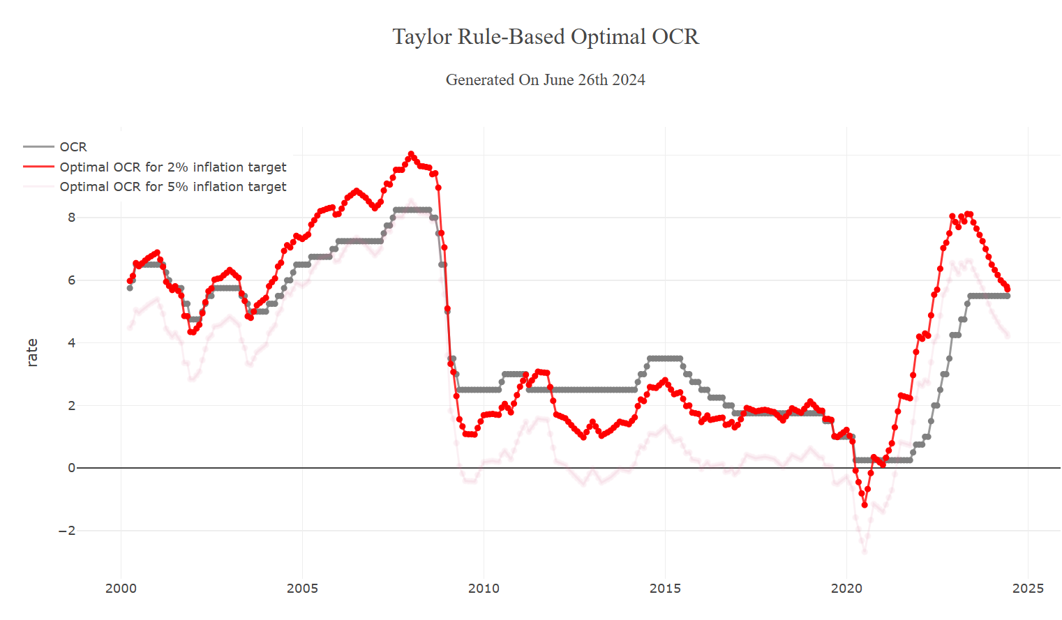
They also do a Taylor-rule based guide to what the OCR should be (over a longer period). Since one of the key uncertainties of the last 15 years has been what is, and what is happening to, the neutral real interest rate I’m sceptical of Taylor rule approaches adding much marginal value. At present, I see little external basis for thinking that the OCR should have been set at 8 per cent last June (rather than the 5.5 per cent actual), and although I was an OCRAG hawk in late 2007 – so quite like the red line being above the grey line then – I’m also sceptical that an OCR of 10 per cent then, or even 9.4 per cent by July 2008, was really what the situation called for.
Click to view
But people should keep an eye on these tools, as just one piece of data to add to the analytical mill.
Michael Reddell spent most of his career at the Reserve Bank of New Zealand, where he was heavily involved with monetary policy formulation, and in financial markets and financial regulatory policy, serving for a time as Head of Financial Markets. Michael blogs at Croaking Cassandra - where this article was sourced.

1 comment:
I also watch the predictor and have been a little skeptical of its value.
However give the huge delays in the official data its a good flag. I do wonder if the daily should in fact be a 2 week smoothed cycle or try to pull the 3 month delay to 4 weeks.
Ultimately would a hybrid be possible all we want is near present data with a direction vector on it.
Post a Comment
Thank you for joining the discussion. Breaking Views welcomes respectful contributions that enrich the debate. Please ensure your comments are not defamatory, derogatory or disruptive. We appreciate your cooperation.